Friday 7 December 2012

Creating Double Page Spread

To create the double page spread for my magazine I used both


This is because I had to use Photoshop to manipulate the photo which I had taken , and increase the canvas size before placing it onto an InDesign document to create the spread. 

The photo which I chose to use for my double page spread was this to begin with ; 


I then used InDesign to put together the double page spread


Thursday 6 December 2012

Final Double Page Spread


Above you can see the final double page spread that I have created for my magazine. I have made some changes since the first draft to develop it further making it look more professional. As planned I used a drop shadow effect on the title of the article and after using it on that, I went on to use it on the pull quote which can be seen in the centre of the right hand page. This makes it a heavier visual weight to the centre of the page which stands out more, making the quote more noticed and attracting readers. I also used an underline feature on the sub title of "what to expect" as that also looked unfinished without  any added detail, especially when the drop shadow made the main title even more powerful and eye-catching, underlining the sub title created a better balance on the page. I also made the pull quote slightly bigger and moved it a tiny bit further down from the colour bar to remove some blank space. Changes I made to the article include making the text slightly heavy so it appeared bolder and easier to read. I also noticed some spelling and grammatically errors that I have now amended and orphans that I have removed. I ensured that all of the lines that created the border around the spread were perfectly straight and met in all of the correct places to give it a sleek finish. Finally I added a page number to the left hand page of the spread as that will make it much easier for the magazine to be followed through the contents page.

I like the way that the finished version of my double page spread is not overly complicated giving it a fresh look which fits well with the feel of my magazine. I also am happy with my decision that I made to clone the background of the image across the double page spread to give it a textured feel instead of editing it to be white.

Wednesday 5 December 2012

Double Page Spread First Draft


This is the first draft that I have created of the double page spread of my magazine. I have tried to link it very specifically to the lady gaga double page spread that I researched in detail and I feel as if I have mostly met this effectively however have adapted some of the design to fit my own photo and ideas. I chose this photo for the spread as I feel it fits very well with the theme of powerful women that I portrayed on my front cover ( with the same model ). I very much like the pose and the models eye line as she can be seen looking into the distance making her seem mysterious.  In my research I found that if the model was stretching the entire width of the page so did the title to ensure that there was a balance on the page. To achieve a balance on my page I positioned the title of the spread to the right hand side of the page as the model is slightly to the left.  I think I have used visual weights well on this spread through the use of the colour bar at the top and centre of my page which is used in conjunction with a pull quote. I am happy with the overall layout and core features of the spread however there are some aspects of it that I will develop to ensure it looks professional and well finished.
As the second page of my spread is very text heavy , I will increase the weight of the writing so that is is easier to read and does not blend together. I have used lines to create the border for the spread and in points they are not perfectly straight or reaching the exact points making it look unprofessional and messy. This is something I must fix. I will also add a page number to the left hand page of the spread as this will make the magazine easier to follow through the contents page.  Finally I feel as if there is something missing on the large features such as the title, subtitle and pull quote, I will attempt to drop shadow these features to see if it improves their aesthetic appeal.

Tuesday 4 December 2012

Double Page Spread Hand Drawn


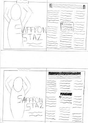
When creating the had drawn designs for my double page spread I feel like I was the most specific with my initial ideas that I have been for all products. I had a very clear idea from the outset, after my initial research of different ways that I could approach the page of how I wanted mine to look. I knew that I wanted a whole page on the left of the spread that was dedicated to a photo of my model and the main title to be on that page with the article on the opposite page. I experimented with different ways that I could present a pull quote in the middle of the article and in my second lot of drawings, bottom images, show how I developed my ideas once I had chosen to use a square pull quote, to add in different elements such as bars of colour and a piece of writing within the border. Out of the two developed drawings I think the bottom one is the strongest and is what I will follow when creating the page.

Monday 3 December 2012

Saffron Staz- Third Shoot

For my double page spread, I will be using the same model that I used on the front cover of my magazine to focus the article around. For this reason I have carried out a third photo shoot with this model so that I can improve some of the poses that I had already tried in earlier shoots and also try new ones.


I tried a few different outfits in this photo shoot to experiment with different looks for my model. However I found that the outfit that reflected the personality of empowerment that I am trying to portray through this model and connected article was the plain black , tight outfit that she wore for the front cover shoots. Similarly to this I experimented with different poses and positioning of the model as well as camera angles. However the ones which I feel worked the best and portray the best attitude is are shoots which I had improved from previous shoots with this model as oppose to the new stuff that I had tried. 

Sunday 2 December 2012

Further and Detailed Double Page Spread Research

My main focus now is on double page spreads that have the image on a page of there own. 

The whole of the left hand side is taken over by a  photo of the model which is being interviewed. It is a mid shot however does not look like this and seems more like a close up due to the dark background and clothing blending in together and her bright hair and skin sticking out closer to the camera.  I like that there is a whole page dedicated to a photo of the artist with none of the article on it as I think it is especially eye catching and makes it extremely clear who the article is about. I do not like the way that there is a dark colour background on one side of the page and a completely opposition bright white on the other page of the spread, I think this make it look more as if the photo is a poster that comes with the magazine and is not attached to the story.
The first thing which I notice about this double page spread is the fact that the image that takes up the whole page is an extreme close up. I don't like this for a double page spread and think that a mid shot suits it much better as it allows you to see more of the person you are reading the article about. However the expression that can clearly be seen on the models face in the close up reflects the attitude of the article which goes with it , this is something that I will concentrate when creating my double page spread. I also don't like the way that there is not a consistent colour that flows across both pages and I think this double page spread looks like it is a poster on one side of the page. I think that the small piece of writing which can be found on the left hand page which is underneath PINK is a good way to introduce the article which is coming.


Although there is a backdrop and features which have been added into this photo on the right hand side of the page I like that it is not a close up of the model and we as readers are able to see more of the model that we are about to be reading about and I think that makes the article seem more revealing which is appealing to an audience. I do not like the way that the text is laid out on the left hand side of this page and think that it does not make it appealing for the audience as it seems as if there is too much to be bothered to engage into.

Detailed Research 


Saturday 1 December 2012

Double Page Spread Initial Research


I will be creating a double page spread for my magazine that will be based on the feature that I presented on the front cover. I will begin my research for this article by carrying out general research on some different ways double page spreads have been created in order to further my research into specifically what I wish to create.


I think that this is a spread which is all about the photo that can be seen on the single left hand side of the page. I like the way that it is an interesting pose which can be seem in the picture however I do not like the writing which is across the figure, however this may be because of the font which I really do not like. The border around the top of the page with a small piece of writing in is effective and makes the page look completed. I think that content of the article which is on its own page is laid out in a very boring fashion. It could be improved by having some larger letters or headlines on the page because at the moment I would not be interesting in reading it.


Although I will be using a female model on my double page spread, I think this is a very effective article. The way that the photo is on one page and the article content on the other  is a way of laying out the page which I really like however by having other feature such a the red boxes hanging over the page makes the article seem as one and not seperate pages. I think that is a feautre about this article which makes it particilarly good. A large headline on the page which is snappy and realted to the article is a good way to draw the reader in from simply looking at the picture to wanting to read the article. I think that having some larger quotes or letters at the start of the article would make it a bit better.


This is a differnt way of presenting the double page spread, the images used are in the middle of the page, aswell as there being more than one of the same model.


The photo which has been used on this article is a close up and I do not like that about it as I don't think that it is appropriate for the double page spread about a story .The name of the model that I will be talking about in the article will be 'Saffron Staz'. This large S that has been used in this double page spread is used for the beginning letter of the article however I think that it takes up too much space and creates a lot of blank around it. I think that this would also look effective if a large letter similar to this was used for the first character  of a headline or quote where the rest of the writing was also larger. I do not like the way that content has been laid out on the right hand side, it seems more as if this is a the introductory section to other pages on the article which will be to follow and is not an appropriate design for what I will be creating.


I very much like the interesting pose which has been used in this article however I think that there is a lot of blank space around the model making it look more like a poster. This could have been improved by having a quote, headline or something else related to the article on the page. Similarly to the one above, I like the use of the large letter on the page , it is a strong visual aid and very drawing for the eye of the reader. On this page not only is a C used for that but it is used constantly throughout in the small headline at the top and for the beginning of a paragraph as well. I like this consistency  within the page as it makes the spread all about the model in question. I don't like the photo which has been used on the left hand side of the page, it looks random and out of place due to how large it is and how close it is to the other photo of the model.  I like the way that this article is laid on in paragraphs apposed to the interview style that states the question and then the answer  I also think that by having a quote of the interview in a larger font size or different color is a good way to attract the reader to want to know what context it has been said in.

From this initial research I have been able to conclude that I feel the style of contents page that I like and would suit the magazine I am creating would be having a large image that takes up most of one page and the content of the article on the opposite page. The two examples that I like the most from this set of research are the top two that can be seen on this page.